Summary
CafeIn - Seat booking app for students and freelancers
TL;DR
This is my first ever personal case study project where I design a cafe seat booking app for those who wants to work from cafe. My role includes: user research, wireframing, prototyping, usability testing.
Results: 14 Screens and 1 modal of UI design after iteration based on usability test findings

Context
Working environment preference
As technologies advance, people tend to prefer working outside of their workplace. Conversation (2020) suggest that working from a cafe can help them to increase their creativity during their working hours. However, the lack of information about the cafe and its seat availability leads to the loss of customer retention in the cafe.
We assume that...
There are maybe no seats left when freelancers/students go to the desired cafe
freelancer/students have no glimpse of idea which time that has the most packed with people
freelancer/student may have no-to little information about the cafe before deciding to go to the cafe
Opportunity to tackle the problem
By providing a seamless booking flow and thorough information about the cafe, this app can help users decide which cafe they go and book to.
Conflict
Take a deep look on user’s attitude
When conducting this research, I plan to interview several people that suit the characteristics. After learning how user think and feel, I separate each findings into 4 themes: The user’s platform expectation; the reason why they work from a cafe; how the user finds a cafe; and the user’s frustration.


Rising Action

How do I improve?
Based on the interview, I break down several priorities that need to be addressed by using a prioritization matrix. I use this matrix design by ranking users’ needs and problems into a list of priorities based on their urgencies and feasibility.
Imagine being a freelancer, trying to book a seat in a cafe
To understand more about our user, I create a user journey map to delved deeper into their journey when booking a seat through our app.

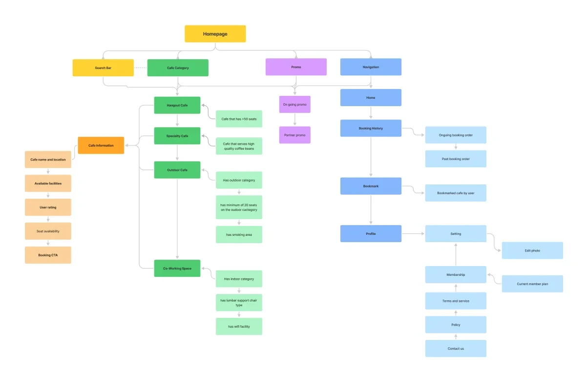
The Backbone of Intuitive Experience: User Flow & Information Architecture
To make a seamless booking flow, I create a user flow as a guideline to the later stages. Information Architecture was also used to organize which element is used in the app. other than that, it will make the app easier to navigate for the user.

Climax
Next step, Visuals!
After a long work of creating the user experience’s fundamentals, I designed a low-fidelity wireframe that serve as initial, low effort design of where the layout and content take place.


Style Guide
I used earthy tones such as green as its primary color to create a warm and inviting aesthetic.
Initial Hi-Fidelity UI Design
After following the lo-fi wireframe and the style guide, I came up with this initial UI design.

Falling Action
Testing my design to suitable users!
To give a broad understatement of how my initial design is easy to use, I asked several participants to do a certain task to know which design is great and which isn’t. 21 participants agreed to join the test and only 13 participants completed the whole test.


46,67% participants clicked the wrong button
The numbers are high! 7 participants clicked the wrong button which lead them to drift from the expected path. This may be caused by the content hierarchy where the “Footprint” is more visible than the categories to the user.
This design may work…
This may work, but most of the participants don’t recognize which element can be clicked multiple times and which is not.

Resolution
Final design solution to tackle the usability findings
Here’s my final adjustment to the design. I move the “Category” section to the top so the user can see it first. For the booking page, I create two groups called “Time and Date” and “My Preferences” to differentiate which elements can be skipped and which isn’t.
